Showing posts with label gesso. Show all posts

Thursday, June 15, 2017

Mix It Up #2

What a lovely week it has been and I am thrilled that the weather is so much more to my liking of being hot. Summer is my favorite season and then Spring. Anyway, today is the day for the Mix It Up Team B's designs and our technique focus this month is stamping! Rubber stamps, cling stamps, hand made stamps-just no digi stamps. :) So without further ado here is my design. Enjoy!

This is my very first time using Gelatos and I have to say I enjoyed it immensely! The colors for this design are all from the iridescent collection. Everything from Black Hole, Lunar, Blue Moon to Satellite, Nebula and Supernova. Cool names for such gorgeous colors!
I used a watercolor canvas and applied a layer of gesso first. I then just slapped on all the colors that came in this set and sprayed it with water letting the drips happen here and there. 

Next came a brand new stencil. I used a white color box ink through the stencil. Since this is a pigment ink it sits on top of the canvas and doesn't dry fast at all. I waited a few days for it to dry.
While my canvas was drying, I decided to try my hand at making a dream catcher. First time doing this as well. I used some broken grape vines I had leftover in my stash and some embroidery thread. I wrapped the thread around the vines and made a circle. I then wove a greenish blue embroidery thread through the circle and made the inside of the dream catcher. It worked! Surprise surprise! I used a Prima word sign and some clear bead things to add some texture to the dream catcher. 
Raiding my feather stash produced some teal feathers, some teal feathers with polka dots, some white feathers and some small metal trinkets from TH Ideaology.
I attached those to the bottom of the dream catcher and then added the silver rose (from Emerald Creek). 

The dream catcher was popped up on foam dots and the middle feather was adhered to the canvas with a hot glue gun. 

The last thing I added was some stamping with random rubber word stamps. I used Distress Ink and slapped down some script. 
You can see the stamping much better in real life but here are more close ups as well.
I used contrasting colors so everything would stand out and the stamping would be visible. 
So get out your stamps and enjoy a good play day, or week! You never know where your paints and colors will take you! Carpe Diem and Hugz! ~Niki

I would enjoy sharing this design with these challenges:


I used Dream Road because creating my own version of art is a dream road I journey down for every piece. 

Monday, February 15, 2016

Altered Rusty Lava Bottle

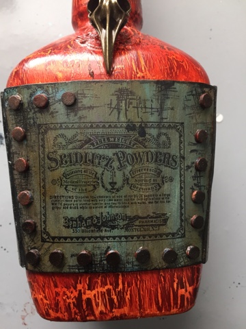
Well a new chapter has started at SanDee&Amelie's Steampunk Challenge. The theme is "Anything Goes" as long as it has a Steampunk(ish), Industrial, or Vintage feel. I wanted to try making something masculine because I don't remember a time where I made something specifically manly. So, I had a Maker's Mark whisky bottle and the process started. Hiccup!
I applied 2 coats of HEAVY white gesso to the entire bottle and left it to dry overnight. I have been learning a lot about altering bottles and using the heavy gesso always works for me. Next came some DecoArt Quinacridone Gold acrylic paint.
I left the label spot blank but could have painted it as well. Then next step was a coat of DecoArt Weathered Wood and when it was dry I painted a layer of DecoArt Transparent Red Iron Oxide. While the paint was drying I layered on some rusting powder to the neck and lid of the bottle then set out making my label. 

The label was made from crafters foam (fun foam) and painted with Quinacridone Gold, then a coat of Titanium white antiquing cream and then a layer of of Patina Green Antiquing cream (drying between layers). I used a baby wipe to rub off some of the antiquing creams and  then randomly painted some Transparent Yellow Iron Oxide here and there. 
I grabbed a few stamps and had some fun then used a paper puncher to make my "nail" heads. Those were made from fun foam and painted with Paynes Grey and Quinacridone Gold. 

A coat of DecoArt Matte Varnish was painted over the labels and some light inking in black was applied to the entire bottle. The side labels were painted the same as the front (and back) and stamped with a different stamp.The picture below is of the side and back of the bottle. Viola! 

I can't wait to see what you create, and remember to check out what my teamies have made as well! Hugz and Carpe Diem! ~Niki


Sunday, February 7, 2016

Altered Glass Bottle, the good, the bad, and the beautiful.

How many of you try a new technique or, for lack of a better word, process, and just end up hating (strong word) the results? I just made an altered glass bottle and even though I did a post about it (HERE), I wasn't happy with it. So, I was determined to improve and experiment. And experiment I sure did! This is only the 3rd bottle I have altered but the first time really experimenting with paints and so many elements and learning what works (for me) to get paint to stick to the bottle.

Now the first thing I wanted to know was-how does paint stick to the bottle? I tried gesso, multi medium and wasn't having the best result. So for this bottle I tried HEAVY black gesso and when it was dry I used the multi medium over the gesso, then applied a second layer of heavy black gesso. Win! I then applied some white gesso and crackle paste randomly with my finger.

The next step was to add all the different elements to form my design. I raided my stash and then some! One thing I have yet to read about is the cost for making this type of bottle. All of these many different elements add up. The metal flowers, the gears and cogs, the springs, the wooden arrows, the pen nibs, the floral pick, the clock face, the metal leaves, the metal filigree.....the end result is definitely worth it but now I know how much it actually costs. Whew! My local thrift store was a shopping haven for some of these elements though. I applied almost all of the elements with a hot glue gun because I couldn't wait for the multi medium to dry (patience isn't my strongest trait, but I am working on it). The hot glue worked very well because I already had the layers of HEAVY gesso and multi medium for the glue to stick to. All of the elements got a good coat of white gesso (not heavy white gesso).
 Color! Now the hard part. For me, adding color to a design is the make or break point because I sometimes don't like the end result. Such was the case for this bottle. I used about 5 different Primary Element mica powders, some Silks and LSG sprays (blues, greens, gold, copper, purple, pink). It was okay but not what I had pictured in my head. This is one reason I love mixed media-you can just keep adding paint! So add away I did!
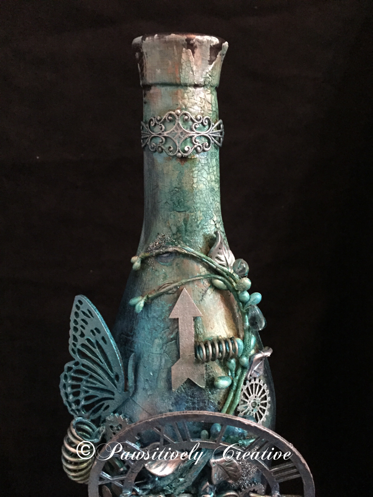
The final layer of paints were only blues. I dabbed, spritzed, sprayed, splattered and even sponged until I was happy. The bottle is dark so you can't really see all of the drips and splatters. When everything was dry I used my finger to apply some silver Rub-n-Buff to highlight areas and then added some Wow Embossing Powder-Vintage Peacock randomly. Here are some close ups. The picture below is of the top of the bottle. Aren't those springs fun!?! I think so. This is where most of the crackle is as well. NOTE WORTHY: All of the pictures I have taken were with an Iphone 6 and no filters. I don't have a camera or use any apps to make my pics look better.

 The picture below is of the middle of the bottle where most of the elements are. I think that the bottom layers of paints/sprays/powders really added nice contrast to this design, and it shows up amazingly in pictures.

This is what I am calling the "bottom" of the bottle. I sure do need some more of those Roman numerals (loves 'em)! See the difference between the indoor vs outdoor pics? The indoor pics show more of the paint colors underneath, whereas the outdoor pics show more of the blue. Awesome sauce!
Outdoor Picture

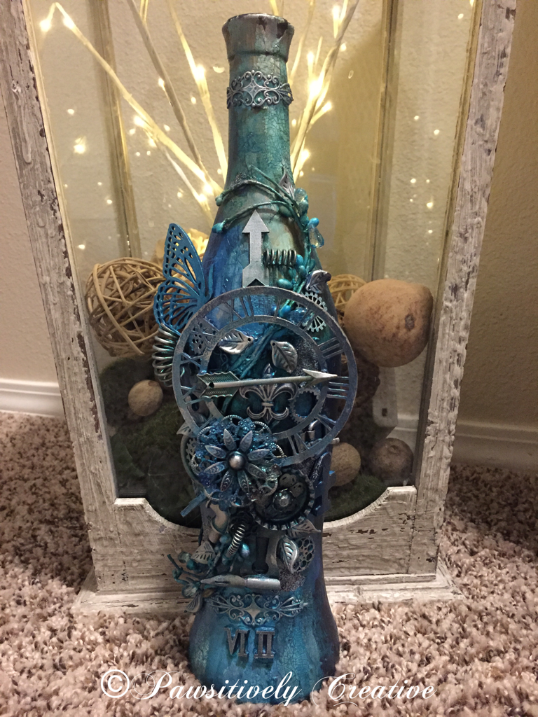
 This final picture is in front of a large lantern I designed for my entryway. I do believe this experiment was a success and my hypothesis was sound-using HEAVY gesso will result in better paint "stickage" to a glass bottle. Hugz and Carpe Diem! ~Niki
I am thrilled to be sharing this altered bottle with these amazing challenges:

I believe I used every color in this color challenge. 
The LSG colors I used the most are: Delphinium Turquoise, Jack in the Pulpit Teal, and Sweet Violet Purple Teal


I took inspiration from the quote. This bottle is a rainbow of color underneath it all.

Simon Says Stamp-Work It Wednesday-Use Something New
(I have used new LSG sprays, Silks, Wow Embossing Powder and new techniques)

Emerald Creek Dares-Love is NOT in the air
This bottle is a perfect gift for a single person, and if it were full they wouldn't have to share any of the yummy wine. :)

UPDATE:
This bottle is featured on Tuesdays Tutorials with Marjie Kemper
http://marjiekemper.com/blog-series


Thursday, January 1, 2015

2015!

Hello y'all! We have a new challenge at Mixed Media Mojo! This months theme is NEW and the twist is to use the number 15.

I used a 7x9 canvas as my base. I am trying a NEW technique of white space and the number 15 (in Roman numerals) is how old my baby girl, Raj, was when she passed to the Rainbow Bridge. 

I made the painting drippings by opening my Lindys Stamp Gang sprays and using the piece of plastic attached to the lid as my paintbrush. I then apied Gesso to the flowers and sprayed my flowers with the same LSG sprays and attached those with glue dots and E6000. 


For the chipboard pieces I painted those with black acrylic paint and also Metallic Purple FolkArt paint. I added some of the metallic paint to the sentiment (Dream as if you'll live forever) as well and adhered that using some rope and dimensional foam dots. 

I have wanted to make an inverted paw print of my girl for awhile but was chicken to try just in case I messed up her original paw print. Thankfully everything worked out. I used white polymer clay and pressed it into the mold. I then baked it and painted it with acrylic paints. 


Can you see the texture from her paw? I love it! The wings are dry brushed with the metallic purple paint as well. 

I added the small bone plaque with Raj's name on it last using TH pegs to hang it from the canvas. This is my tribute to my lovely, faithful best friend. Bless her heart and she will never be forgotten. The metal corner pieces I kept raw. 

I hope you enjoyed this process because this piece means more to me than any other. Thanks for stopping by and Carpe Diem! 

This will be shared with the following:

Altered Eclectics-Anything Goes Mixed Media HERE

Rhedd's Creative Spirit-Anything Goes Altered Art/Mixed Media Only HERE


Thursday, August 21, 2014

Flutterby Butterflies

I wanted to create a canvas with a layered tag look to it and incorporate soft colors. This is not my usual art but I think I did a good job. :)

I started with the tag and used the colors from that to design this piece. I found this amazing metallic acrylic paint and just had to have it. Lol! The blue, purple, and green are metallic paint and it is so gorgeous! I used a TH edger tool to roughen up my paper edges (paper is from Scraps of Elegence/Scraps of Darkness store) and then layered the papers behind the tag. I stamped the bottom two layers to give depth and to tie in my chipboard embellies that I also stamped. 
I then started on painting the canvas with the green metallic paint. I added some cheesecloth that I sprayed with Luminarte sprays and glued it to the canvas. 

I painted the chipboard flourishes with gesso and stamped words on both. I then used a butterfly cutout to make the small blue butterflies that are around the canvas. 

One of my favorite pieces on this is the small little container in the bottom left corner. It started as a bronze color and I hand painted the blues, green and purple to make it look like it belonged with this canvas. I thought it looked like I let the small butterflies out of this jar. :p

I then glued everything where I wanted it and added the finishing touches. Carpe Diem!

Thanks for stopping by and leaving your lovely comments, it brightens my day! Carpe Diem!~€

This canvas will be entered into the following, you can enter as well:

SOE/SOD mid month challenge on Facebook (HERE)

Country View Challenges-Word Play (HERE) I used the words Unlock Your Dreams and Explore Your New Reality to express my open mind about all things crafty I will, or may, get in to.

Artistic Stamper Creative Team Blog-August Challenge Anything Goes (HERE)

Our Creative Corner-Summertime (HERE) Summer to me means plenty of color and butterflies and exploring!

Craft-szafa-Challenge #42-mood board (HERE) I used the soft colors and texture I took from the welcome sign.