Showing posts with label challenge. Show all posts

Sunday, October 1, 2017

Vampire Hunter Journal

What a wonderful October! So happy that Halloween is so close (even though I will be spending this Halloween in the hospital with my husband while he gets a new hip). I have wanted to create a Vampire Hunting Kit for almost 2 years now and figured with the new challenge at Mix It Up, this would be the perfect time to get a start on it. And every hunting kit needs a journal, or two or three journals! Happy October y'all!
I started with a piece of leather and embossed it with a new embossing folder. You can't really see the embossing well in these photos and in retrospect, it looks like the leather didn't take the embossing well. Lesson learned.
I then hand bound 20 white 82lb pages with wax thread and added those to the inside of the journal because lets be honest, who the heck would want the pages outside the journal? Not me! Defeats the purpose. I am in a weird mood while writing this. Haha!
While the pages were sewn into the journal, I added a Tim Holtz metal tag to the seam of the outside of the journal. Nothing fancy, just some knots to make it stay in place.
This vampire hunting journal was downloaded from How to Haunt Your House (they have some amazing downloads for Halloween!) I printed it on a laser printer and then bound it just like the leather journal. Each page was distressed and grunged up.
I used some distress inks, distress stains, archival inks, acrylic paints for splatters, and even some dirt from my yard. The edges of the journal were given an aged look with a pair of scissors. I think I pulled out all of my browns, yellows, and dark colors and just kept layering until I liked the look.
The pages with a vampire that have been killed are highlighted with a red skull and a capital D. The book tells you how to kill the supernatural and also who is deceased. Such a cool and interesting read.
I had to add some red alcohol ink and red distress ink to each page to give it a sinister feel. If any Vampire Hunter had a journal, it sure wouldn't look all nice a pristine! Hard work means dirty items! Bwahaha!
Hopefully you all have a wonderful and fun October! I know I will be adding to my vampire hunting kit, guess you will just have to visit again if you want to see what else is going to be in the kit! Carpe Diem! Thanks for reading and visiting! HAPPY HALLOWEEN!

I would like to share this with these challenges:


I was inspired by the quote. "Give it a try said the heart". I have been wanting to make this and finally gave it a try! 

Sunday, April 9, 2017

New Challenge Blog!

Why hello there crafty people's. I sure hope your weekend is going well. I have some BIG news to share about a new blog in blogland. It's called Mix It Up Challenge. This is a technique based challenge blog that will make you want to try new things. Cool right? Yeppers. I happen to be on the Design Team (yippee!) and just wanted to share the news.
The challenges start in May but we are doing a "Just For Fun" challenge for April.  You can design anything your heart wants. Mix It Up and try something new if you feel up for it. Anything Goes with this Just For Fun challenge. And you can also become a follower. You could even possibly win a prize! Awesome sauce! 

Click HERE for the link to the challenge.


Happy Crafting and Carpe Diem! Hugz. ~Niki


Tuesday, March 7, 2017

Broken Art

Well I have been back in my art room for the first times since December. I lost my mojo, it plum left me for a few months. I didn't even really want to look at anything art related. Rock bottom is what it was like, but just for art and not anything else. I am not sure why this happened or if it will again, but I have an inkling about what started it. So now I am trying new things and even took an online course from Andy Skinner (more to come on that). We shall see what happens. The design I am sharing today has been remade about 8-9 times. This piece has been on multiple journey's, color schemes, details added and taken away. Only today was I able to see a clear picture of what it wanted to be. Thank goodness! Lol. I give you
  Broken Art


The frame was found at a thrift store and I saw so much potential.

 FIRST IDEA: The initial project was going to be a Valentine's Day gift. Ever see those frames on Pinterest that say "Spooning Since ..."? Well that idea didn't pan out because my metal stamping stamps wouldn't stamp into the spoons. 

2ND IDEA: lots of chippies and a frame to hang jewelry. The metal mesh that is inside the frame wouldn't hold anything and actually broke rather easy. No pics. 

3RD IDEA: soft pastel colors to create a Prima inspired design. That was nixed almost immediately when I went to gather supplies. I have no pastels. Lol!

4-7TH IDEA-didn't work

8TH IDEA: altered rusty paintbrush. Hmmmm, that is feelin about right! Here is how it went down. 
I am not sure exactly what I did because everything you see in the picture above was used. The frame got some paint and stamps were added with Versamark. Then I used about 3-4 embossing powders. The metal corner pieces are from Emerald Creek and heat embossed with Charred Gold.

Stamps, stencils, metal tidbits, paints, sprays, micas, texture paste, crackle paste, embossing powders, and on and on. I did add some white paint around the edge of the paintbrush to define the edges because it was getting lost in the pictures. What a journey! 
The end result was so very different than what I had started with. I am okay with that. Add in the flinging of the splattered paints and drips and drops, it was fun, and fun is what I was after. That was the journey that I wanted to take. 
Thanks for stopping by and Carpe Diem! Enjoy the journey. We all have Broken Art somewhere just waiting for that light bulb to go off in our brain. Hugz! ~Niki

I want to send this piece on more journey's so I took it to a few different places to get my photos. I will be sharing it with these challenges: 


I came "aboard" by reaching my own destination for learning to "art" again and have fun doing it after a dry spell.

I believe I used 4 stamps, maybe 5 and that is just on the frame alone. Not counting the stamps hidden under the paint on the altered paintbrush.

I was inspired by the dark background with the highlights of the purples, blues and teals. I used a CE leafy vine frame chippie as the focal point of the altered paintbrush.   

Sunday, June 19, 2016

Time Moves On

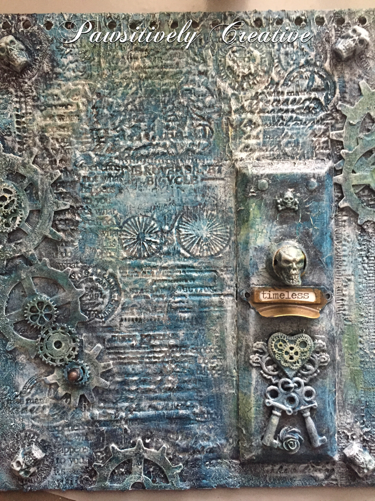
Well it sure has been a busy time here at my house. I am painting and designing my master bedroom and is a big undertaking but the end is in sight! I really wanted to share this Time piece and stamping into modeling paste again. Fun stuff, this is sort of where my stenciling brayer technique came from. Anyhow, I altered this cover. It was black and white with a lot of poof to it, like it was stuffed with something and I figured it was TIME to change it. Lol.
I started with DecoArt black gesso, then some DecoArt modeling paste. Waited for it to dry a bit then grabbed lots of stamps and stamped away! Then added some skulls, an old door plate, some gears and some more skulls, and a pull handle. An eclectic mix but it makes sense in my brain. :) Then painted with black gesso again. This is an Andy Skinner technique.
I then applied a wash of Titanium white paint, let it dry, then a wash of my new favorite DecoArt color Prussian Blue Hue! Gorgeous color!!! I left some areas white for a nice ghostly contrast. 
Random spots of DecoArt Q-gold and Red Oxide. The Media line of acrylic paints from DecoArt are awesome sauce for layering. 
You may have noticed I left the drawer pull alone. This is a play on words. My Skellies and other pieces have been "aged" by time and have essentially died but metal stays around a lot longer hence the sentiment "timeless". Although I did apply some paint to see what it would look like, in the end I wiped the paint off.  Multiple dry bushing with Titanium white was done as the last step. This design took time because of the layers of paint and I wanted to try different colors. There was some Phthalo Green-Blue and Titan Buff but I covered those up. 
Hope y'all are having an amazing weekend and enjoying everything you do! Hugz and Carpe Diem! ~Niki

I would like to share this altered cover with these challenges: 


Sunday, February 7, 2016

Altered Glass Bottle, the good, the bad, and the beautiful.

How many of you try a new technique or, for lack of a better word, process, and just end up hating (strong word) the results? I just made an altered glass bottle and even though I did a post about it (HERE), I wasn't happy with it. So, I was determined to improve and experiment. And experiment I sure did! This is only the 3rd bottle I have altered but the first time really experimenting with paints and so many elements and learning what works (for me) to get paint to stick to the bottle.

Now the first thing I wanted to know was-how does paint stick to the bottle? I tried gesso, multi medium and wasn't having the best result. So for this bottle I tried HEAVY black gesso and when it was dry I used the multi medium over the gesso, then applied a second layer of heavy black gesso. Win! I then applied some white gesso and crackle paste randomly with my finger.

The next step was to add all the different elements to form my design. I raided my stash and then some! One thing I have yet to read about is the cost for making this type of bottle. All of these many different elements add up. The metal flowers, the gears and cogs, the springs, the wooden arrows, the pen nibs, the floral pick, the clock face, the metal leaves, the metal filigree.....the end result is definitely worth it but now I know how much it actually costs. Whew! My local thrift store was a shopping haven for some of these elements though. I applied almost all of the elements with a hot glue gun because I couldn't wait for the multi medium to dry (patience isn't my strongest trait, but I am working on it). The hot glue worked very well because I already had the layers of HEAVY gesso and multi medium for the glue to stick to. All of the elements got a good coat of white gesso (not heavy white gesso).
 Color! Now the hard part. For me, adding color to a design is the make or break point because I sometimes don't like the end result. Such was the case for this bottle. I used about 5 different Primary Element mica powders, some Silks and LSG sprays (blues, greens, gold, copper, purple, pink). It was okay but not what I had pictured in my head. This is one reason I love mixed media-you can just keep adding paint! So add away I did!
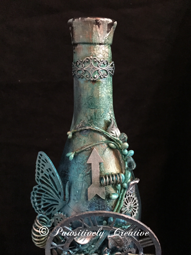
The final layer of paints were only blues. I dabbed, spritzed, sprayed, splattered and even sponged until I was happy. The bottle is dark so you can't really see all of the drips and splatters. When everything was dry I used my finger to apply some silver Rub-n-Buff to highlight areas and then added some Wow Embossing Powder-Vintage Peacock randomly. Here are some close ups. The picture below is of the top of the bottle. Aren't those springs fun!?! I think so. This is where most of the crackle is as well. NOTE WORTHY: All of the pictures I have taken were with an Iphone 6 and no filters. I don't have a camera or use any apps to make my pics look better.

 The picture below is of the middle of the bottle where most of the elements are. I think that the bottom layers of paints/sprays/powders really added nice contrast to this design, and it shows up amazingly in pictures.

This is what I am calling the "bottom" of the bottle. I sure do need some more of those Roman numerals (loves 'em)! See the difference between the indoor vs outdoor pics? The indoor pics show more of the paint colors underneath, whereas the outdoor pics show more of the blue. Awesome sauce!
Outdoor Picture

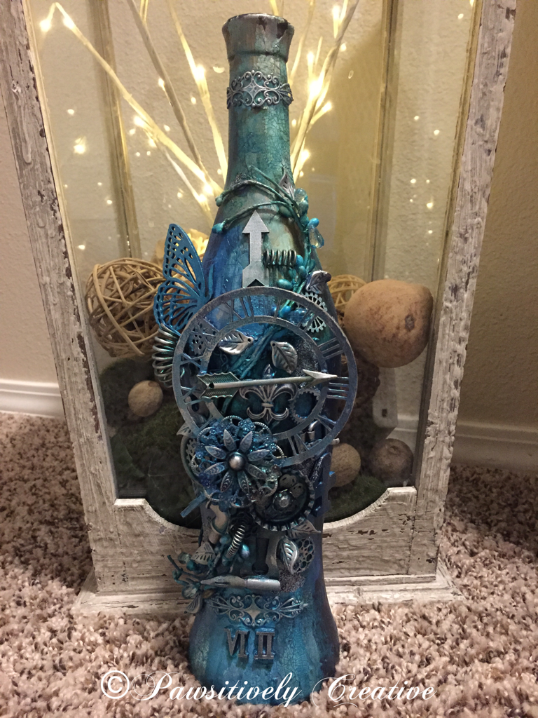
 This final picture is in front of a large lantern I designed for my entryway. I do believe this experiment was a success and my hypothesis was sound-using HEAVY gesso will result in better paint "stickage" to a glass bottle. Hugz and Carpe Diem! ~Niki
I am thrilled to be sharing this altered bottle with these amazing challenges:

I believe I used every color in this color challenge. 
The LSG colors I used the most are: Delphinium Turquoise, Jack in the Pulpit Teal, and Sweet Violet Purple Teal


I took inspiration from the quote. This bottle is a rainbow of color underneath it all.

Simon Says Stamp-Work It Wednesday-Use Something New
(I have used new LSG sprays, Silks, Wow Embossing Powder and new techniques)

Emerald Creek Dares-Love is NOT in the air
This bottle is a perfect gift for a single person, and if it were full they wouldn't have to share any of the yummy wine. :)

UPDATE:
This bottle is featured on Tuesdays Tutorials with Marjie Kemper
http://marjiekemper.com/blog-series


Thursday, January 28, 2016

Wicked Wonderland

Ohhhh dearies, today has been a day. A day of frustration and everything that could go wrong, did. But that is okay because tomorrow is a new day and it's also Friday! TGIF! I really wanted to design something with a glass bottle, probably going to be years before I do it again. I also wanted to use polymer clay (it didn't turn out so it may show up on another project). Here is the end result.

I used gesso first but that didn't work well, so I added tissue paper around the entire bottle. I created an ombré effect around the bottom of the bottle using DecoArt paints and then added crackle paste over that.  

After the paste was dry, I washed it with diluted DecoArt Cobalt Teal Hue and then layered over that with DecoArt Interference Turquoise. It sure does shimmer and shine! 

I added the antiquing cream to the bottom of the bottle and then wiped off until I was happy. I used antiquing cream Titanium white on the lid. I added some snowflake rub ons as well. 

The snowflakes were painted to mimic the ombré paints of the bottle and glued down. SnowTex was used to add some faux snow and while it was wet Glamour Dyst was liberally sprinkled over it. More shimmer! 

I totally forgot to take in action pictures. Oops! Hope you enjoyed otherwise. Lol! Hugz and Carpe Diem! ~Niki

DecoArte products used: 
Media Acrylic-Cobalt Teal Hue, Media Acrylic Interference Turquoise, Media Acrylic-Cobalt Turquoise Hue, Media Acrylic Shimmer Mister-Turquoise, Media Antiquing Cream-Carbon Black, Media Antiquing Cream-Titanium White, Americana Satin-Turquoise Waters, Media Crackle Paste, Dazzling Metallic-Shimmering Silver, Dazzling Metallic-Purple Pearl, SnowTex-Snow Writer, Glamour Dust. 

I would like to share this altered bottle with: 


Sunday, October 25, 2015

Book of Horror!

Ohhhh October, how I enjoy thee! I wanted to design something really gory and disgusting. The other night I was watching Hocus Pocus and thought to myself "what would the sisters book look like for a rated R movie?" And here is what came to mind. This is the Book of Horror, enjoy or be disgusted-the choice is yours! (Evil laugh in the background) And some exciting news at the end of this post!
I started with a plain paper mâché book, added some gesso to the entire thing and some black leather to the edge. The leather lends a vintage feel to the spine of this wicked creation and also adds age. Can you see the bloody hand print on the spine?
Then I started sculpting with polymer clay. Now I have never done this before so there is always room for improvement but this is the first take. I lightly drew out where the eyes, nose, and mouth would go then went at it. 
I kept pushing the clay around until I was satisfied (kinda) with the results. Then it went into the oven to bake. While the grotesque face was baking I started on the back of the book. I glued down some interesting lace stuff, painted over it with gesso, and added some more polymer clay. I had to use air dry clay on the back and I am not a fan of it, I much prefer Sculpty. 
Next came adding the skin color and let me tell you, skin is hard to paint. There are so many shades and hues to skin. I used DecoArt Media line colors: Red Iron Oxide, Yellow Iron Oxide, Quinacridone Burnt Orange, Quinacridone Gold, Paynes Grey, Carbon Black, and Raw Umber Antiquing Cream. The flesh tone was achieved by mixing a pale pink and Americana Zinc with a dab of Adirondack Hazelnut. You just have to play with the colors and go with your gut. 
The picture below is when the entire back section was done. I really am diggin the "wet" look of the exposed flesh. This wet look was achieved by using DecoArt Liquid Glass and DecoArt Media Mister-Red. I added some paint splatters to break up the skin color and give it some depth with the colors mentioned above. The "sutures" are made with rusty wire from my stash, with each one hand shaped and glued with Glossy Accents to the pulled and stretched skin!
I did work on the front and back pieces intermittently but didn't glue the front piece until it was entirely done. The teeth were a sore spot for me. I wanted it to look like the teeth had realistic gums so I added some more clay and pushed my "teeth" into the clay to create grooves. I will send something to the first person to guess what the teeth are made from.
I pulled all the teeth out and baked the clay, then added the teeth back to their spot. The teeth got a makeover (or make-under) with a wash of DecoArt Media-Yellow Iron Oxide and Quinacridone Gold. The gums, eye sockets, nose socket, and exposed flesh were painted Red with the DecoArt Media mister (love that Red! And I also love that after it is dry, none of the red seeps into my paintbrush when I layer colors over it!) The skin was painted the same way a the back of the book. The eyeball was aged with a wash of Yellow Iron Oxide and made to look gooey with Liquid Glass.
The "page" part of this book was made by applying thick and thin amounts of DecoArt Crackle Paste. Once that was dry I gave it a wash with DecoArt Paynes Grey and Old Paper DI. Then I rubbed on some DecoArt Raw Umber Antiquing Cream and wiped off the excess with a paper towel. (you may have noticed that I use the Antiquing Cream as a wash, paint, and dry brush-very versatile stuff!)
Creepy little guy! In the picture below you can see the colors from the washes I gave the "pages". Lastly I added DecoArt matte Varnish to all the edges. 
The spine was distressed with texture paste and the Andy Skinner stencil-Code Breaker. I aged the texture paste with DecoArt English Red and Titanium White Antiquing Cream as well as dry brushing it with DecoArt Red Oxide and the hand print on the spine was made by painting my hand with the Red Oxide and grabbing the spine on this Book of Horror.
The face kinda has a sad look to him. I hope you don't meet this Horror out and about on Halloween night! You may be the next in line to be skinned! Mwaha ha ha! Hopefully you weren't too disgusted that you blew chunks, although if you did I would like to know. Happy Haunting and Carpe Diem! ~Niki
                                               

This delightfully grotesque book will be shared with these horrific challenges: 


A darker art blog spot, so check it out!


I have been accepted into the DecoArt Blogger Outreach program and this is my first design! I am happy to share and learn more about their products. I have to say that as of right now my favorite supplies are-Liquid Glass and Red Oxide.