Showing posts with label fun. Show all posts

Wednesday, October 5, 2016

Explore Autumn

Hello there everyone and Happy Fall ya'll! I sure hope you all are enjoying each day to the fullest. Autumn makes me think about Giving and getting together with family, not to mention having a bountiful harvest. My Grandmother has been in the wheat business for years, and the farm has been passed down through generations. Wheat, corn, corn mazes, pumpkin patches, hay rides and so much more are starting here in my neck of the woods and that got me thinking about what to design for Autumn. Here is my canvas:
Today is the start of a new challenge at Anything But Cute and our wonderfully talented Autumn of Sew Paper Paint is our Hostess. She chose the theme of "An Autumn Day" and describes it as follows:
"I could not help but choose October as my month to hostess here at Anything But Cute. This month, we want to see your creations inspired by An Autumn Day.  Anything goes mixed media with an fall color palette, or Autumnal elements.  Be inspired by nature with the sights, smells, and sounds of this beautiful season.  We cannot wait to see the amazing artwork you turn out!"
Perfect theme for this time of year in my part of the world. I started with a flat canvas and then laid down some stencil work using matte texture paste. While the paste was still wet I sprinkled on some clear glitter, and because I am an impatient person, I used my heat tool to help the paste dry faster. :) After it was all dry I added multiple colors of distress inks and kept blending until I was okay with it.
Next came all the embellishments. I was gifted this orangish burlap and had to use it on this design. I cut it into strips and glued it to the canvas with a hot glue gun. 
I pulled some of the threads from the burlap to give it a distressed look and then got my acorns out. I gathered these while visiting my Grandmother for Thanksgiving last year and to celebrate her 90th Birthday. I did have to glue the acorns back into their shells. Hehe! 

The rest of the embellishments are picks from various stores. I added and altered and layered until it looked right to me. 
The bows were made with some leftover ribbon and jute. Those bows took forever to make but persistence pays off. 
The corn husk was inked up and fringed up a bit. The husk part was lightly misted with water and cut into smaller sections that I could curl back. The devil is in the details right? Yeppers.
A couple of metal elements were added and the word "Explore" was added because the cooler days mean exploring more of my town. And voila! Done. Hopefully you all are staying warm and enjoying your day. Carpe Diem! Hugz! ~Niki

I would enjoy sharing this design with these challenges: 

I am celebrating Fall and the harvest of the wheat crop. Not to mention the celebration of the upcoming Holidays. 

Friday, August 5, 2016

Shabby Garden Barn Doors and Peeled Paint

Hello there dearies! I am back after a month long break and ready to share with you all my newest design. I have been decorating my home and am wanting to put barn doors up in my kitchen and in my bedroom for a rustic vibe. It is on my to-do list but I needed to get the idea out of my head and with the new challenge over at Anything But Cute, I knew this was a win win situation. I give you my version of a Shabby Garden.

The doors are on hinges and open to reveal the secret garden elements inside. 
Lisa the Fantabulous, of Mermaid Crafts, is our hostess for this month at Anything But Cute #16, and the theme is inspired by her mood board of this Shabby Garden. 

Here is what she would like to see: For this challenge, we are asking you to take a stroll through a romantic shabby garden. Create any mixed media project strongly inspired by the mood board. Think flowers and plants in cracked pots, peeling paint bird feeders, distressed timeworn furniture, crumbling statues, soft pastels and feminine accessories. Don't forget to tell us how the mood board inspired your project and have fun!

This is an 8x10 reverse canvas. I used cardboard from a box to cover the front. I cut out the middle with an exacto knife. Then I added a Layer of white gesso and when dry peeled back some of the cardboard. Next came a layer of DecoArt white chalky paint. The inside lip of the canvas was painted with the chalky paint as well. 
While the chalky paint was drying (it really doesn't take long though) I started constructing my barn doors. I used the backing from a calander. The doors got the gesso and white chalky paint base. 

While many people use wax to create the peeled paint technique, I found it didn't give me the look I wanted (I really did try it). I randomly painted chalky paint (Relic and Turquoise) over the white base. Then tried the wax layer. Blah! 

So I re-did it with CHAPSTICK! Yeppers, I seem to have an abundance of Chapstick laying around and liked the smell (hehe!) so I swiped it over the areas I wanted to "crack and peel"! It worked like a charm and you can see the "cracks" it created after I painted over the Chapstick with the white chalky paint. 

After the top layer of paint is dry, take a sanding block and GENTLY sand over the areas you want to distress. This will reveal the colors below and creates a wonderful peeled paint shabby look! TIP-I also used this technique of the Chapstick on my shabby wall shelf in my bedroom! Works great! I also stamped a rose design using the shadow stamp technique. You can see these on the gram and the front and back of the doors. 

Anyway, I used a plain piece of scrapbook paper to make my background. I heat embossed a stencil design and a word stamp from the Artistic Stamper, then I scraped off some of the embossing powder before I used my hearing tool. I used white and grey EP. Then I grabbed a pipette and dribbled my shades of blue from the DecoArt media line and spritzed with water to create a watercolor effect. 

After the background was dry I added some stamped feathers, small flowers and sprigs. I used ink around the edges of the small white flowers to give some added blue color. 
And there you have it! My take on a Shabby Garden. This was a challenge and out of my comfort zone but it was a totally BLAST to design! Hugz and Carpe Diem!
Closed Doors
Sneak Peak! :)
Open Doors!

I would love to share this Shabby design with these challenges:


Some of my best moment this summer are planting new flower beds and learning how to make a butterfly friendly "bird bath" (you add flat marble stones to it so the butterflies can stay above the water)


The Artistic Stamper-Anything Goes

A Vintage Journey-Stencil It
I used the TH flourish stencil on the frame and the background inside the canvas

Mixed Media Place-Be Inspire by the mood board. 
I used the blues and the overall shabby feel of the board and was inspired by the over hanging tree path. 


Sunday, June 19, 2016

Time Moves On

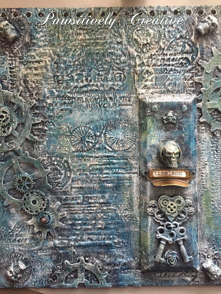
Well it sure has been a busy time here at my house. I am painting and designing my master bedroom and is a big undertaking but the end is in sight! I really wanted to share this Time piece and stamping into modeling paste again. Fun stuff, this is sort of where my stenciling brayer technique came from. Anyhow, I altered this cover. It was black and white with a lot of poof to it, like it was stuffed with something and I figured it was TIME to change it. Lol.
I started with DecoArt black gesso, then some DecoArt modeling paste. Waited for it to dry a bit then grabbed lots of stamps and stamped away! Then added some skulls, an old door plate, some gears and some more skulls, and a pull handle. An eclectic mix but it makes sense in my brain. :) Then painted with black gesso again. This is an Andy Skinner technique.
I then applied a wash of Titanium white paint, let it dry, then a wash of my new favorite DecoArt color Prussian Blue Hue! Gorgeous color!!! I left some areas white for a nice ghostly contrast. 
Random spots of DecoArt Q-gold and Red Oxide. The Media line of acrylic paints from DecoArt are awesome sauce for layering. 
You may have noticed I left the drawer pull alone. This is a play on words. My Skellies and other pieces have been "aged" by time and have essentially died but metal stays around a lot longer hence the sentiment "timeless". Although I did apply some paint to see what it would look like, in the end I wiped the paint off.  Multiple dry bushing with Titanium white was done as the last step. This design took time because of the layers of paint and I wanted to try different colors. There was some Phthalo Green-Blue and Titan Buff but I covered those up. 
Hope y'all are having an amazing weekend and enjoying everything you do! Hugz and Carpe Diem! ~Niki

I would like to share this altered cover with these challenges: 


Thursday, May 26, 2016

Sneaky peek-Anything But Cute Tutorial

Hello lovelies! I hope today finds you all in good spirits and with a happy smile on our face! I am sharing a few tips and tricks over at Anything But Cute for our Spotlight Artist post today, using a most wonderful medium for your mixed media makes! Find out more about this tutorial by visiting here! The picture below is just one of numerous ways to use this product. Enjoy!
And don't forget to join our current challenge "Celebrate Your Style" that runs until June 4th! Our awesome sauce sponsors Alleystamp, Emerald Creek and The Funkie Junkie are giving away some FANTASMIC prizes! Hugz and Carpe Diem! ~Niki

Thursday, May 5, 2016

Celebrate You!

Hello lovelies! Today is a super special day because it is our 1st Anniversary over at Anything But Cute! We have an exciting challenge in store this month and want to CELEBRATE! I wanted to create something that I have never tried before and also use one of my favorite movies as inspiration so I came up with this design. Meet my version of Jack Skellington and his dog, Zero!

As we celebrate our First Anniversary at Anything But Cute, we want you to celebrate what you do best...mixed media! This is your chance to do it your way, in your favorite style...so pull out those inks and paints and show us what you're made of! You can make anything you want, in any theme you want and any style you want, just as long as it has some mixed media products on it and no cute images. HAVE FUN!

We have some special treats for you this month. Along with our design team projects, we have invited our Favorite Artists from last year to come and celebrate with us. You don't want to miss the incredible line up of inspiration they have provided for you!! We also have a wonderful line up of prizes from some amazing sponsors...lots of chances to win some goodies, so don't miss out!

I started this design by sculpting Jack. He has a wire armature inside him because I wanted his arms to move and they do, although I did accidentally break his arm off, and had to fashion it back together! Sorry Jack!
I then added his legs, his bat bow tie, his eyebrows, his hands, and got to painting with acrylic paints. 
Zero was easier to sculpt and his collar was painted with red acrylic paint and his nose is orange acrylic paint. Yes, I added shoes to Jack. Hehe! 
I then started on my background while everything was baking in the oven. I tried a tag background with different designs but wasn't feeling it so I decided to create a tombstone. I drew out my shape on regular paper and used it as a template to trace onto thick matboard. I wanted the tombstone to be one sturdy piece to hold all these wonderful elements (I even add a kickstand to the back of the tag so it would stand on its own). The edges of the tombstone are made from a mold (I only used a section of the mold). You can see in the picture below what the stones and bricks are made from: I hoarded some of these foam pieces but for the life of me, I can't remember what art supply they came with. It's left over packaging of some sort. Any ideas? I think it is from dies.
I cut the foam and made my bricks/stone and glued everything (including the molded boarder) with TomBow Multi. Then at this point everything was painted with black acrylic paint. The texture sand in the picture below didn't end up showing up because of where I placed Jack. Oh well. Hehe! 
I used so many different paints and daubers to get the stones/bricks the color I wanted, then I applied white acrylic paint in certain spots to highlight areas. The inside of the tombstone was inked up with a stencil just for some depth. 
Then I started adding all the pieces together one little detail at a time. Some Spanish moss.............
A new clock mold and the pillars are new molds as well. All three were painted grey then antiqued. A few pumpkins, and a black branch looking thing. 
Some pumpkins and art stones that were painted with acrylic paints, a few bats...........
And finally some closeups of Jack and Zero! I did paint Jack's name on the bottom step of the tombstone but you can't really see it. 
Jack's head moves, as well as his arms. 
I know this was a long post and thanks for reading until the end. Don't forget to check out what my lovely teamies have designed! Hugz and Carpe Diem! ~Niki
I would like to share this design with: 


My "doll" isn't paper exactly but he's a sort of doll. 

I went LOC with a Halloween design. 


Sunday, February 7, 2016

Altered Glass Bottle, the good, the bad, and the beautiful.

How many of you try a new technique or, for lack of a better word, process, and just end up hating (strong word) the results? I just made an altered glass bottle and even though I did a post about it (HERE), I wasn't happy with it. So, I was determined to improve and experiment. And experiment I sure did! This is only the 3rd bottle I have altered but the first time really experimenting with paints and so many elements and learning what works (for me) to get paint to stick to the bottle.

Now the first thing I wanted to know was-how does paint stick to the bottle? I tried gesso, multi medium and wasn't having the best result. So for this bottle I tried HEAVY black gesso and when it was dry I used the multi medium over the gesso, then applied a second layer of heavy black gesso. Win! I then applied some white gesso and crackle paste randomly with my finger.

The next step was to add all the different elements to form my design. I raided my stash and then some! One thing I have yet to read about is the cost for making this type of bottle. All of these many different elements add up. The metal flowers, the gears and cogs, the springs, the wooden arrows, the pen nibs, the floral pick, the clock face, the metal leaves, the metal filigree.....the end result is definitely worth it but now I know how much it actually costs. Whew! My local thrift store was a shopping haven for some of these elements though. I applied almost all of the elements with a hot glue gun because I couldn't wait for the multi medium to dry (patience isn't my strongest trait, but I am working on it). The hot glue worked very well because I already had the layers of HEAVY gesso and multi medium for the glue to stick to. All of the elements got a good coat of white gesso (not heavy white gesso).
 Color! Now the hard part. For me, adding color to a design is the make or break point because I sometimes don't like the end result. Such was the case for this bottle. I used about 5 different Primary Element mica powders, some Silks and LSG sprays (blues, greens, gold, copper, purple, pink). It was okay but not what I had pictured in my head. This is one reason I love mixed media-you can just keep adding paint! So add away I did!
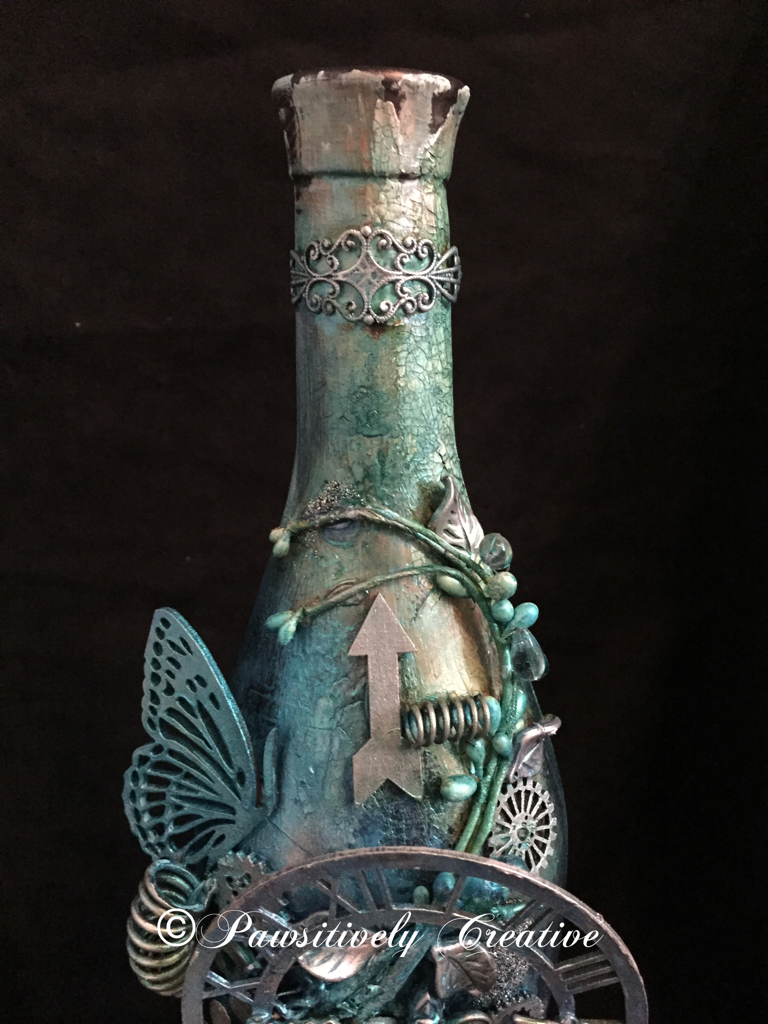
The final layer of paints were only blues. I dabbed, spritzed, sprayed, splattered and even sponged until I was happy. The bottle is dark so you can't really see all of the drips and splatters. When everything was dry I used my finger to apply some silver Rub-n-Buff to highlight areas and then added some Wow Embossing Powder-Vintage Peacock randomly. Here are some close ups. The picture below is of the top of the bottle. Aren't those springs fun!?! I think so. This is where most of the crackle is as well. NOTE WORTHY: All of the pictures I have taken were with an Iphone 6 and no filters. I don't have a camera or use any apps to make my pics look better.

 The picture below is of the middle of the bottle where most of the elements are. I think that the bottom layers of paints/sprays/powders really added nice contrast to this design, and it shows up amazingly in pictures.

This is what I am calling the "bottom" of the bottle. I sure do need some more of those Roman numerals (loves 'em)! See the difference between the indoor vs outdoor pics? The indoor pics show more of the paint colors underneath, whereas the outdoor pics show more of the blue. Awesome sauce!
Outdoor Picture

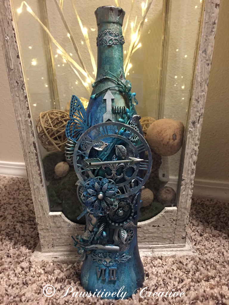
 This final picture is in front of a large lantern I designed for my entryway. I do believe this experiment was a success and my hypothesis was sound-using HEAVY gesso will result in better paint "stickage" to a glass bottle. Hugz and Carpe Diem! ~Niki
I am thrilled to be sharing this altered bottle with these amazing challenges:

I believe I used every color in this color challenge. 
The LSG colors I used the most are: Delphinium Turquoise, Jack in the Pulpit Teal, and Sweet Violet Purple Teal


I took inspiration from the quote. This bottle is a rainbow of color underneath it all.

Simon Says Stamp-Work It Wednesday-Use Something New
(I have used new LSG sprays, Silks, Wow Embossing Powder and new techniques)

Emerald Creek Dares-Love is NOT in the air
This bottle is a perfect gift for a single person, and if it were full they wouldn't have to share any of the yummy wine. :)

UPDATE:
This bottle is featured on Tuesdays Tutorials with Marjie Kemper
http://marjiekemper.com/blog-series