Showing posts with label clock. Show all posts

Sunday, February 7, 2016

Altered Glass Bottle, the good, the bad, and the beautiful.

How many of you try a new technique or, for lack of a better word, process, and just end up hating (strong word) the results? I just made an altered glass bottle and even though I did a post about it (HERE), I wasn't happy with it. So, I was determined to improve and experiment. And experiment I sure did! This is only the 3rd bottle I have altered but the first time really experimenting with paints and so many elements and learning what works (for me) to get paint to stick to the bottle.

Now the first thing I wanted to know was-how does paint stick to the bottle? I tried gesso, multi medium and wasn't having the best result. So for this bottle I tried HEAVY black gesso and when it was dry I used the multi medium over the gesso, then applied a second layer of heavy black gesso. Win! I then applied some white gesso and crackle paste randomly with my finger.

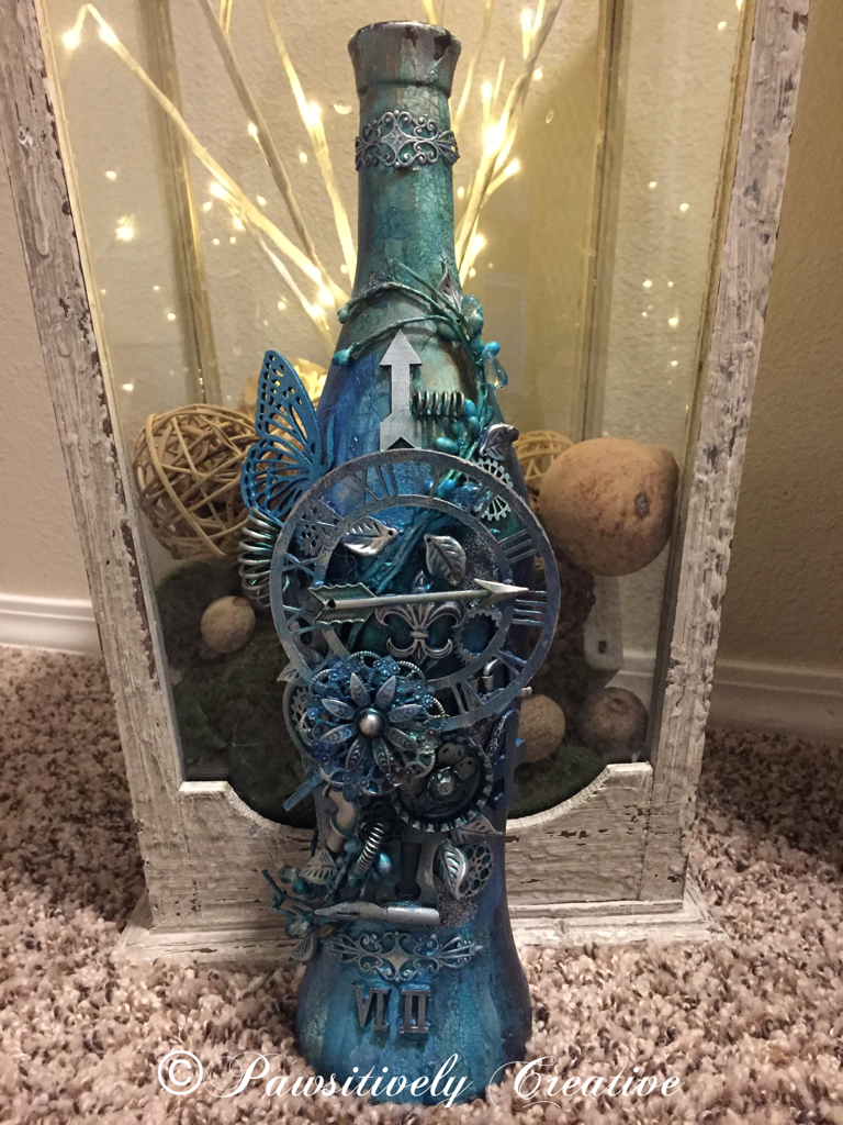
The next step was to add all the different elements to form my design. I raided my stash and then some! One thing I have yet to read about is the cost for making this type of bottle. All of these many different elements add up. The metal flowers, the gears and cogs, the springs, the wooden arrows, the pen nibs, the floral pick, the clock face, the metal leaves, the metal filigree.....the end result is definitely worth it but now I know how much it actually costs. Whew! My local thrift store was a shopping haven for some of these elements though. I applied almost all of the elements with a hot glue gun because I couldn't wait for the multi medium to dry (patience isn't my strongest trait, but I am working on it). The hot glue worked very well because I already had the layers of HEAVY gesso and multi medium for the glue to stick to. All of the elements got a good coat of white gesso (not heavy white gesso).
 Color! Now the hard part. For me, adding color to a design is the make or break point because I sometimes don't like the end result. Such was the case for this bottle. I used about 5 different Primary Element mica powders, some Silks and LSG sprays (blues, greens, gold, copper, purple, pink). It was okay but not what I had pictured in my head. This is one reason I love mixed media-you can just keep adding paint! So add away I did!
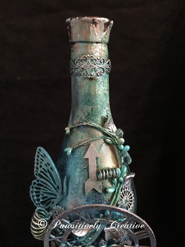
The final layer of paints were only blues. I dabbed, spritzed, sprayed, splattered and even sponged until I was happy. The bottle is dark so you can't really see all of the drips and splatters. When everything was dry I used my finger to apply some silver Rub-n-Buff to highlight areas and then added some Wow Embossing Powder-Vintage Peacock randomly. Here are some close ups. The picture below is of the top of the bottle. Aren't those springs fun!?! I think so. This is where most of the crackle is as well. NOTE WORTHY: All of the pictures I have taken were with an Iphone 6 and no filters. I don't have a camera or use any apps to make my pics look better.

 The picture below is of the middle of the bottle where most of the elements are. I think that the bottom layers of paints/sprays/powders really added nice contrast to this design, and it shows up amazingly in pictures.

This is what I am calling the "bottom" of the bottle. I sure do need some more of those Roman numerals (loves 'em)! See the difference between the indoor vs outdoor pics? The indoor pics show more of the paint colors underneath, whereas the outdoor pics show more of the blue. Awesome sauce!
Outdoor Picture

 This final picture is in front of a large lantern I designed for my entryway. I do believe this experiment was a success and my hypothesis was sound-using HEAVY gesso will result in better paint "stickage" to a glass bottle. Hugz and Carpe Diem! ~Niki
I am thrilled to be sharing this altered bottle with these amazing challenges:

I believe I used every color in this color challenge. 
The LSG colors I used the most are: Delphinium Turquoise, Jack in the Pulpit Teal, and Sweet Violet Purple Teal


I took inspiration from the quote. This bottle is a rainbow of color underneath it all.

Simon Says Stamp-Work It Wednesday-Use Something New
(I have used new LSG sprays, Silks, Wow Embossing Powder and new techniques)

Emerald Creek Dares-Love is NOT in the air
This bottle is a perfect gift for a single person, and if it were full they wouldn't have to share any of the yummy wine. :)

UPDATE:
This bottle is featured on Tuesdays Tutorials with Marjie Kemper
http://marjiekemper.com/blog-series


Sunday, January 24, 2016

Dark and Radiant

You know how you have those days where your head is full of new creative ideas and you just keep going? This weekend has been like that for me. I love it when my muse is working overtime! I have been on a canvas kick for a little bit and today is another 5x7 canvas.


How I wish you could see the shimmer and radiant awesomeness of the gel thats in the background (it's like texture paste)! Gorgeous and more gorgeous! I set up my design first to see where everything would go. 

 I used white gesso to cover my canvas, then added some white texture paste and when that was dry I painted the entire canvas with black gesso. After the black gesso was dry, I used a palette knife to add the Colour Arte Radiant Gel-Guatemalan Green. 
 When the green paste was dry, I added back all of my black gessoed elements and glued everything down. 

Using Colour Arte Silks- Wisteria and Vintage Mint I painted the flowers and the dragonfly. I added the gems last.

The crown was painted with Inka Gold-Violet, as were the clock hands. The clock face was painted with Colour Arte Silks-Warm Gray. Black Finnabair micro beads completed the canvas.

I also tried a new idea. I used a script stamp from Rubber Dance Art stamps and inked it with the Radiant Gel then randomly stamped along the side of my canvas. I've done it with paint but never paste. :) It didn't turn out as well as I expected but I am going to try it again!
This was a fun play in the art studio this weekend. I tried so many ideas, some went in the reject pile and some are still a WIP but it was a joy to just spend some time enjoying the way my brain thinks, some good me time. Hugz and Carpe Diem! ~Niki


I would enjoy sharing this design with these fantastic challenges: 


(all of the Colour Arte paints and the gel are new)

(all of the Colour Arte paints and the gel are new) 


(my heart sings for a darker color palette)


Friday, January 15, 2016

DecoArt at SanDee&Amelie's

Hello y'all! Today starts another challenge at SanDee&Amelie's Steampunk challenge. There have been a few changes but I promise you'll like em. We start with our new sponsor-DecoArt! How cool is that? At SanDee&amelie's Steampunk Challenge, we have the great honour and pleasure of having gained DecoArt as our "one and only" prize sponsor from now on, the whole team decided to put a special spotlight on some of the fabulous products from their wide range of media and paints. 

So this month each DT member not only used DecoArt paints and media on her DT project, but also introduces more closely one of the products she has used. 


Here is what I decided to make. This is my first time trying this Andy Skinner technique (which you can see HERE) and of course I put my spin on it. Enjoy! This is going to be a long journey.
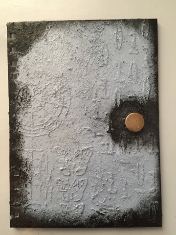
I have had this art journal for over a year and only have 4 pages done in it. So I decided to start with the cover thinking if it looked better, I would be more inclined to use it. Hehe! 
I added some texture paste through 2 stencils, the number stencil is from Andy Skinner. I then added some sand texture paste thus starting the painting technique showcased in the video by Andy Skinner. 
I kept adding paints making sure everything was dry between layers. 
Then came the clock and gear chipboard piece. I watched another video (HERE) and used this technique (first time trying this one as well) but changed up the colors. Yellow green for the base. 
Then Cobalt Turquoise Hue applied using a new texture stamp. This is where I added my own spin to the painting technique because I just kept adding color until I was happy. 
The clock/gear chippie was glued down with DecoArt Liqui Glass and then whitewashed with DecoArt Titanium White antiquing cream. 
This is what it looks like all put together with the rest of my Art journal. The picture above is closer to what it looks like in real life. I don't think the lighting does it justice though as it isn't this washed out and blurry (like the pic below shows). Darn photos. :) 
Here is a quick peek at the prize package you could win! You have to be "In it, to Win It!" Just remember to have fun and enjoy the process. Hugz and Carpe Diem! ~Niki
I would like to share this art journal cover with these lovely challenges:

(I have used 2 new techniques, and a new texture stamp)


(Anything Goes altered art)

(I used numbers, some of the colors from the board and plan to make time to use my art journal) 

(Anything Goes Altered Art/Mixed Media)

Monday, October 5, 2015

31 Day of Halloween at Anything But Cute

October is here and that means another challenge at Anything But Cute. Our super inspirational, and Halloween loving hostess is Sara Emily! For this challenge she would like you to make a mixed media card or project for Halloween. It can be spooky or not, but you MUST include the number "31" somewhere in your project. Let your creativity take over and enjoy! 

Let me take you through "31 Halloween Hauntings!" Mwahahahaha! Enter if you dare!
I started with a Tim Holtz assemblage clock and applied so many different sprays, inks, DecoArt crackle glaze, DecoArt texture paste, and acrylic paints as well. Let's see the process! 
I applied 3 coats of gesso and dabbed some texture paste and texture sand here and there. Then waited forever for it to dry! 
This is after the first coat of LSG sprays and DecoArt Turquoise Waters Satin acrylic paint and DecoArt Patina Green Antiquing Cream (I used the Cream after all the layers were on the clock as well as before)
While the clock was drying (when you heat metal it gets hot so I opted to wait for some stages to dry, my fingers thanked me), I started on my moon background using Distress inks and TH crackle paint for the tree. The moon is yellow and orange and the black smudges are dark clouds. The smallest gravestone includes the number 31. 
The graves are all handmade out of polymer clay, I used various objects to create the graves and then I "aged" the graves using a wash of DecoArt acrylic paint in Zinc and gesso, as well as LSG spray. 
The skeletons were purchased at a local dollar store (4 on a string) and I sprayed those with Heidi Sawpp's Black Velvet spray, I dry brushed both skeletons with DecoArt black acrylic paint. I made the females clothes with leftover fabric tidbits from other projects. Both skeletons accessories are made from polymer clay. 
The small pumpkins are made from polymer clay and painted with black DecoArt acrylic paint and the brushed over with Silks-Spiced Pumpkin. You can see one of the pumpkins beside the lady skeletons head and one in the graveyard.
I added some Halloween stickers and moss that I handpicked near a friends cabin, and some Spanish moss was used for the floor of the gaveyard. The bats are inked with alcohol inks and attached to rusty wire that I twisted around the end of a paintbrush. I adhered those to the clock with a glue gun. 
Here is a close up of the inside of the clock. These 3D designs are sometimes hard to photograph!
I do hope you have enjoyed reading this post and it gets you to thinking about the number 31 and also Halloween, which is right around the corner! I have my hat almost done for October 31st! I wear a hat for the trick or treaters that come to my house, never too old to join in the fun! 
Thank you all for reading this, I know it was a long one! Hope you all have a terrific October and remember: this month candy has no calories, right? Snickers and Milk Duds here I come! What is your favorite candy? Carpe Diem! ~Niki

I would really love to share this altered clock design with the following challenges:


I used the center of Bat, Free Space, Moon

I chose to go LOC with the Halloween theme and Horror theme

DecoArt Mixed Media Haunts Challenge-Showcase their mixed media product line


Monday, June 15, 2015

Ravaged Patina

So happy to share this piece with you all because it is one of my new favorites and also because I tried so many new ideas and techniques! The challenge at SanDee&Amelies Steampunk Challenge this month is-Ravages of Time. Think of crackle, patina, rust, worn out, peeled paint, peeling wallpaper, kapeesh?


This piece started out quite dull and un-interesting but the awesome part is a crafty friend of mine gave it to me to see what I could turn it into. Phone not included. Lol

I painted the box with black gesso and while it was wet added some white tissue paper to create some texture. Then sealed it with matte mod podge. 
While that was drying I started on the clock face, a Creative Embellishment chippie (love their Steampunk collection!). I added special effect paste and texture sand randomly to give it, well, Texture! :)
Once it was dry I used my finger to "paint" gold modeling creme over the entire piece. The bad news is I forgot to take pictures of the painting process because I was in the Zone! I spritzed and sprayed it with everything but the kitchen sink. 

Add some Cheery Lynn gears and cogs (I believe that a Tim Holtz cog is in there as well) with some foam dots to create depth of the gears and painted those the same way as the clock, kinda. 

To achieve a patina look I decided to do my own version, as I couldn't find any tutorial that suited what I saw in my mind.  I just kept adding and dabbing sprays, mists, Inka gold, Silks, and distress paint until I was happy. 

Here are some of the supplies I used, but not even 1/10 of everything I used. :)

I then swiped black StazOn to the raised tissue paper for definition. 

The last item added was the "time" sticker and "love the journey" rub in the bottom right corner. 

Here are some close ups and more pics:
Love that texture!
Depth and layers. 
Sun
It is amazing how different this patina looks in the sun vs indoors. Amazeballs!


I have never said this before about a piece I have made BUT-the pictures do not do it justice! Hopefully you are inspired to join in the fun at our Steampunk corner! 


Thank you to all that have read through this entire post, I know it is a long one! Hugz and Carpe Diem! 
~Niki

I would like to share this design with the following, wonderful challenges: